Getting your fintech brand right: stand out with color
 From the palette of a company’s branding to particular buttons and graphics used throughout the customer journey, color choices can have a significant impact on a product’s ability to effectively inspire adoption and usage with the right audience.
Colors and emotions are closely linked. The psychological effects of color on our experiences and decision-making matter. Every color evokes different emotions and feelings, which can affect the way a tech product, for instance, makes customers feel, and therefore the actions it inspires them to take. Understanding color psychology is a key aspect of creating a color palette that works well in digital design. While color is sometimes thought of as a purely aesthetic choice, it is, in fact, a key component of the psychological impact of a design on users, and as such, its UX.
Many fintech startups tend to use purple or blue color palettes in their branding. As such, these colors are gradually being associated with financial products. New startups are beginning to feel like they need to follow the trend or they will be the odd one out. However, using the same colors also makes it harder for new brands to stand out in an increasingly crowded market.
So, how can a startup determine what colors make sense for their brand? The team at Catalyst Fund worked with Kenya-based B2C savings app Koa, to revamp their branding, including their color palette, and help them better reach and inspire their target audience: Kenyan millennials and Gen Z youth looking for an easy way to save towards their goals.
What is color psychology?
Color psychology is the study of the influence of colors on human mood and behavior. Our mind reacts to colors both consciously and subconsciously. The moment our eyes perceive color, they connect with our brain, which gives signals to the endocrine system, releasing hormones responsible for shifts in mood and emotions. There is a lot of research being conducted today to study the peculiarities of these reactions, and this research can be helpful across industries, including business, marketing and design.
Have you ever wondered, for instance, why the retail industry uses the color red during clearance sales? It’s because red is considered to be the most emotional color. Red has the power to create a sense of urgency and excitement; it is effective in drawing people’s eyes in and convincing them to give in to impulse. Red is also, however, associated with negative connotations, bankruptcy and errors, so it should be avoided in the context of financial products. Alternatively, many fintech startups tend to use hints of blue or purple in their branding because these colors are associated with security and wealth.
When it comes to the application of color in product design, a properly selected color palette helps put users in the frame of mind that compels them to take action. It takes only 90 seconds for people to make a subconscious judgment about a product, and between 62% and 90% of that assessment is based on color alone. Having basic knowledge of color psychology can be useful in improving conversion rates, nudging users to take a particular action and building brand loyalty for a product.
Why fintech companies use blue, purple and green
Many financial service companies want their brand to express trust, security and respect. Whether they are a bank, a payments platform, a personal finance tool or an advisory firm, the common theme is money. Companies want to show status and wealth, but also empathy and loyalty. People want to be sure they can trust whoever is handling their finances.
The below table shows some of the most commonly used colors by brands in the top 250 global finance companies for 2020.
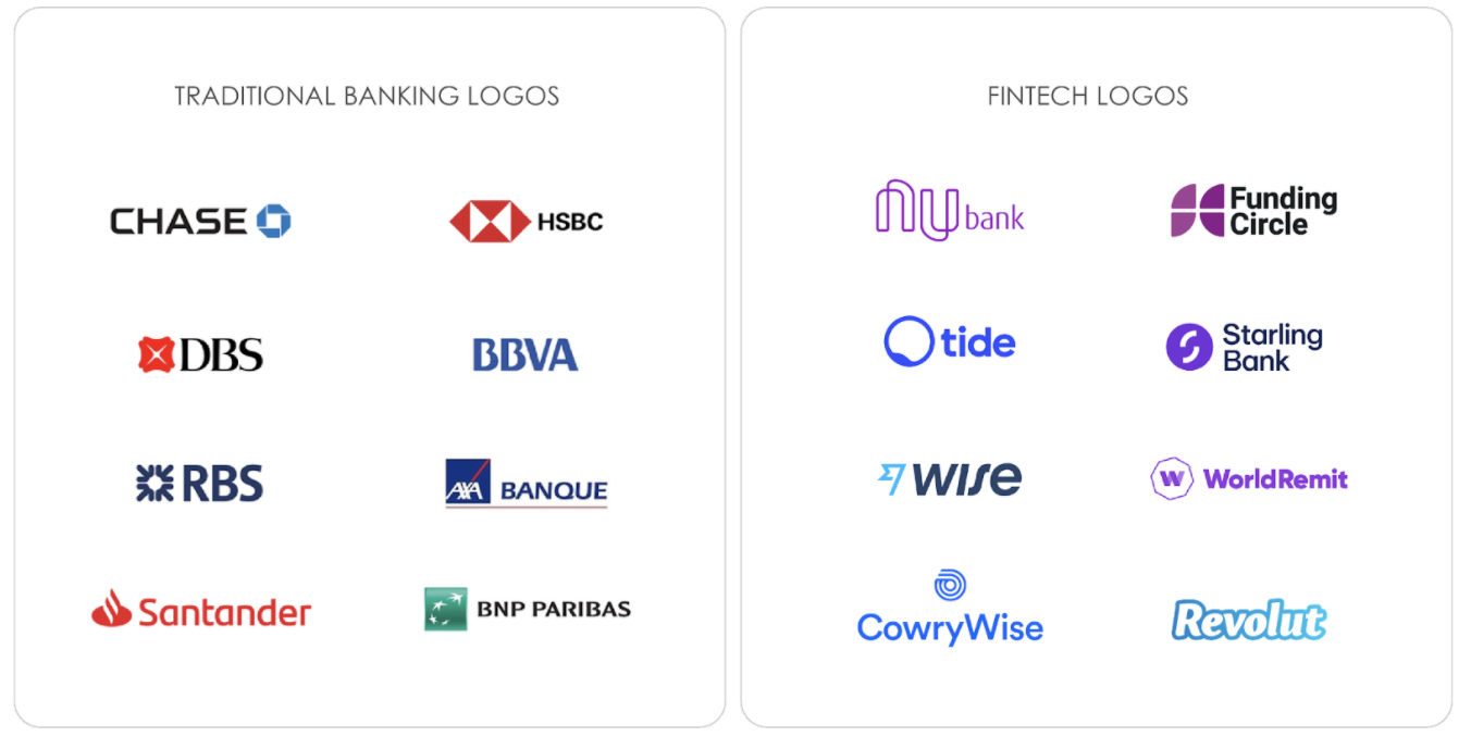
Red tends to be the go-to colour for traditional banks while fintech companies’ brand colours are mostly purple or blue. As such, it is becoming more apparent that there is a need for fintech startups to develop a unique visual identity that users associate solely with their brand.
The color of trust (blue)
Blue is often the most popular color choice for tech brands, either as a primary or secondary color. This may be because blue is associated with trust, confidence and security. Blue is a universal color that anyone can identify with. A study conducted by Hurlbert and Ling suggests that both female and male participants react faster to blue contrasts.
Accessibility is also an important factor. Approximately 10% of the human population is red-green colorblind; hence blue is a suitable color everyone can visualize.
The color of money (green)
Green gives off a subconscious feeling of wealth. Green is also the second most visually pleasing color, as it is also extremely common in nature, so users are naturally pulled towards it. We tend to see an abundance of green in our environments, and because of its relation to nature, green is considered healing and calming. Brands with bright green colors tend to appear as humble and accessible to their users.
The royal color (purple)
Purple symbolizes status, the future, as well as spirituality and harmony. Psychologists claim it is associated with royalty, fantasy, spirituality, mystery, dignity and luxury. Unlike blue and green, purple is rarely seen in nature, so it connotes mystery and creativity.
Purple was announced by Pantone Color Institute as color of the year 2014, and is still very trendy. Purple is expressive, creative and embracing – all of which is important in modern society.
“Radiant Orchid (Purple) reaches across the color wheel to intrigue the eye and spark the imagination. An invitation to innovation, Radiant Orchid (Purple) encourages expanded creativity and originality, which is increasingly valued in today’s society. An enchanting harmony of fuchsia, purple and pink undertones, Radiant Orchid (Purple) inspires confidence and emanates great joy, love and health.”
– Leatrice Eiseman, Executive Director of the Pantone Color Institute on the former color of the year
More and more app icons on our mobile phones are purple or have hues of purple, as shown below:
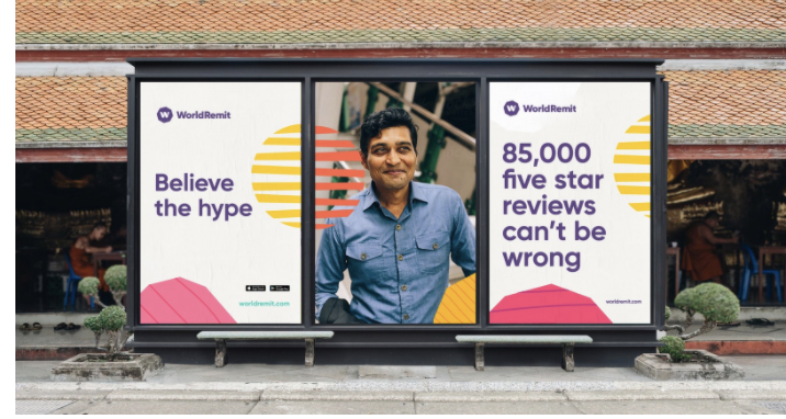
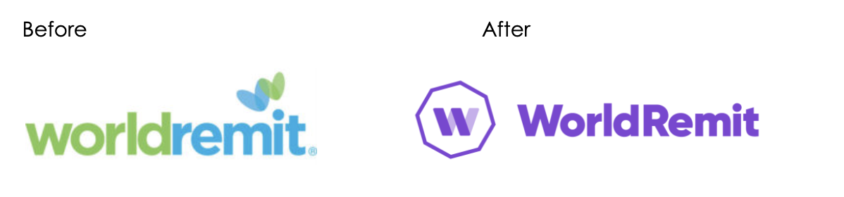
In 2018, WorldRemit rebranded and implemented their new visual identity across all online and offline channels served across 140+ markets globally. WorldRemit’s choice of purple for their logo shows forward-thinking product development.
Because purple has become the go-to color in the fintech space, there is now an overabundance of this color among fintech products, which makes it harder for those who adopt this hue to stand out. Startups in the space need to adopt new colors to stand out from the rest, while still communicating trust and warmth.
Case study: Koa
Koa is a digital savings companion for Kenyans that makes it easy to start saving instantly and stick with it through personalized, goal-based targets that put users on a clear and visible path toward financial freedom. Koa’s mission is to enable digital-first youth to save, protect and grow their money by leveraging an easy-to-use app via channels that they already know and trust. Koa allows users to create custom goals or use popular goals to save towards.
When working with Koa on their branding, we chose guava as their primary brand color, which is a mix of orange and pink, to create warmth and bring forward their human-centred mindset. Although, Koa could have also easily leveraged the purple colour just as the other fintech startups in their space have done. We felt that they would have only fully benefited from the purple trend if they had got in early as established fintech companies, like Nubank, Starling Bank and WorldRemit had already developed their brands based on the Purple.
To get the same feeling as purple, while still achieving distinction, guava struck the right balance. The use of guava as a primary colour is completely unexpected for a money-related company. We chose this color palette because of the feeling of warmth it brings, while still feeling stable and trustworthy. Koa also tweaked its logo typeface during the branding exercise, adding playfulness and uniqueness to the brand experience and giving it a youthful vibe given its target segment.
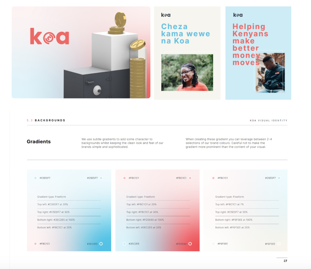

Secondary colours of blue were also introduced to be utilized for backgrounds, illustrations and gradients to reserve the primary colour for key details like headlines and call to actions, helping users to naturally gravitate towards taking those actions.
Beyond color choices, it’s important to note that startups like Koa need to think through their complete brand experience, conveyed across every touch-point, including the right tone of voice, messaging and channel strategy, to create a personality that users resonate with and to build trust.
Summary
There are a number of colors that will fit any fintech brand immediately, including blue, green, purple and black. However, to unlock the real potential of a brand’s visual identity, companies need to first identify their brand’s target audience and the type of emotion they want that identity to evoke.
Branding a fintech company or a product presents a unique set of challenges. There’s an essential coldness to technology and finance that can only be overcome by a powerful, human-centric brand experience. It is time to rethink old standards and break the pattern, especially when it comes to startups that are desperate to stand out from the crowd.
In truth, there are no bad colors; there is only bad use of color. If fintech startups want to improve user acquisition or retention they need to think deeply on how to solve challenges through strategic design and branding efforts in which color plays a big part.