4 cross-selling strategies for fintech startups
Startups often treat cross-selling like customer acquisition, trying to sell the customer from ground zero on a totally separate, new product. They often overlook the fact that with cross-selling strategies, the customer has already been acquired! To succeed, startups need to develop cross-selling strategies that position additional products as amplifications or extensions of the user’s existing engagement, so they feel like the natural next step in the customer’s journey. The goal is to deepen the relationship with customers, ensuring you meet their diverse set of needs via products developed through user and UX research.
In this blog, UX and product design expert Maureen Macharia, founder of Spindle Design, walks us through four do’s and don’ts of UX for cross-sell that she helped Catalyst Fund portfolio company Meerkat deploy. These strategies are concrete ways that startups can better organize and display information on their platforms so as to help users discover and engage with additional product offerings, thereby increasing customer lifetime value.
1.
Drive conversion by minimizing the steps to use a new product because lengthy, complicated initial registration processes are a barrier to conversion and account creation.
Don’t:
Especially when trying something new, users are sensitive to lengthy, multi-step processes and requests for confidential information. They want to discover or explore the new product or suite of products without barriers or hoops to jump through and use this exploration as a way to decide whether or not to proceed.
Furthermore, when asking for information, startups often neglect to educate new users on why they are collecting that data. This is because they tend to prioritize the business’ need for user information over the customer’s experience in providing it, which ends up tanking the sale. For example, asking for ID numbers, bank account information and income levels should all be treated as sensitive “asks” that are made only once trust is established. While businesses need to collect data, asking for it upfront, without having delivered value first, is a sure way to cause customer drop-offs.
Do:
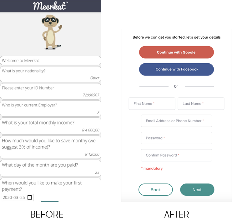
Instead, startups should defer or postpone data collection where possible, and tailor any requests to fit the specific product in question. They should avoid asking users for large amounts of information (that may seem irrelevant to them) at the outset. Leveraging familiar registration options such as Facebook and Google (“Continue with Google”), can further smooth the registration process and minimize “asks”.
Startups should also think about how they can provide users with tangible value before asking for information. This could include a free report, a self-assessment tool or other types of relevant engagement that provides users with immediate benefit.

In the case of Meerkat, the team was able to streamline their onboarding process and reduce the number of steps necessary for a user to register on the platform and access a range of their products. Instead of a series of personal questions, new users are now faced with a simple registration process, which includes contact information so that the Meerkat team can drive engagement.
Furthermore, as described below, upon registration, Meerkat provides new users with a free credit score and an in-depth debt review. The score is accompanied by a branded snapshot of the user’s financial health as well as corresponding strategies to improve their score. This way, users get a sense of how Meerkat’s product offerings can help them get to better outcomes in a tangible way.
2.
Anchor on an initial experience and then orient the user toward other relevant products, while preserving the flexibility and control for them to opt-in when desired.
Don’t:
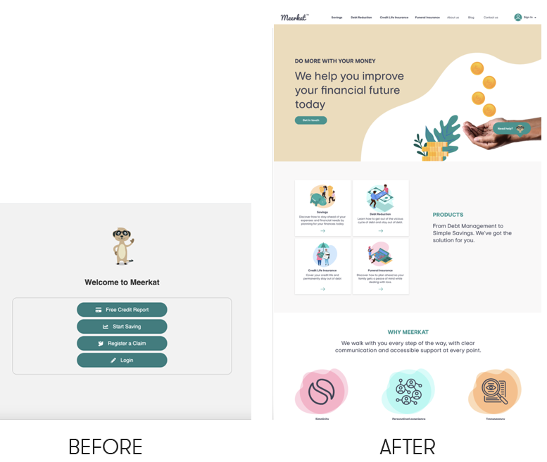
Startups often go wrong by offering too many things at once, and not giving users guidance on what product will help them, or how to engage. They may present a large menu, with many options, but the user does not know how to get started. In these instances, freedom becomes crippling.
Do:
Users prefer to start with a single product as a way of “testing” the experience as this helps them build trust and “verify” that the product is credible. Once they have experienced value through this exploration, users are more open to signing on for additional products.
Given this expectation, startups should design an entry point or anchor to their offering, and direct new users to this anchor as the first step in the funnel. This anchor serves as a way for users to meet, get to know, and test their experience with the provider, before committing to further engagement. This first experience should be carefully constructed to minimize “asks” and provide immediate value to users and start to build a foundation of trust.
Good anchors not only benefit users, they also nudge users in the right direction, helping them make informed decisions in the future. They often foreshadow the product journey by showing a current starting point along with suggested actions for now and for the future. A good anchor opens the door for future engagement and for a personalized experience.
Meerkat was able to leverage their credit score product as an anchor. Once users input their financial information, the platform provides a credit score and explains to a new user what the score means, how to improve their score, and proposes relevant financial products that would improve their score. Users appreciate the relevance of the information, get immediate value from the interaction, and can prioritize their needs going forward, including how to best engage with Meerkat. With a credit score in hand, users can go on to opt into many, one, or no products. This freedom and sense of choice are essential because they allow consumers to select and sequence products according to their needs and financial capacity.
The credit score also gives Meerkat important information about the user. It helps to create a personalized experience born out of an understanding of the user’s financial needs, goals, and behavior that is critical to a successful cross-sell strategy.
3.
Minimize the user’s memory and action load by making options, actions and features visible when the user needs them.
Don’t:
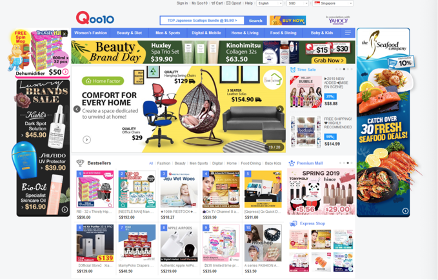
Startups tend to offer too many options or not enough on each page. Many clutter a single page with too many options for services and users cannot understand the information presented. In other instances, startups tend to hide features in menus and submenus that users are not likely to encounter in their normal engagement.

Furthermore, for underserved populations, startups need to be considerate of connectivity and data cost issues. Websites or platforms that are full of heavy visuals will be slow to load and may waste precious data. Similarly, startups need to think through functionality for users with older phones, or who may be less comfortable using apps.
Other mistakes include using inconsistent terminology and language to describe various actions or options. This forces users to remember definitions or unintuitively deduce the intended function.
Do:
Instead, startups should strive for visual simplicity and aim for content simplicity in organizing elements on the interface so that users can easily discover new products in their journey. It is important to use language the user understands and maintain consistent use of the terminology.
Iconography and other visual aids such as themed coloring and consistent placement of items can help returning users find the functionalities they want. Startups can also employ visuals and pictures that users can quickly associate with specific actions or information.
Furthermore, startups should minimize the user’s memory load by making objects, actions and options available when users will need them. For example, all essential information should be on the same page as the call to action button. Users should not have to remember information from one dialogue to another, or shuffle between pages to retrieve the information they need to understand products and make a decision.
Finally, discoverability is the critical aspect of designing for cross-selling strategies. Core services should always be easily visible, and it is critical to have a good user experience in learning about new services to drive uptake of those offerings.

4.
Present products in the context of a users’ needs as a unified goal, journey, and experience, and avoid treating them as standalone objects.
Don’t:
Startups often treat offerings as standalone products since that is how they are managed internally. Each product is presented as a separate option with varying requirements, instead of as a suite of products that constitute a linked and integrated experience. In doing so, startups transfer the burden of product discovery to consumers and miss the opportunity to treat cross-sell as a way to deepen engagement with their users.
Do:
Startups should treat their cross-selling strategy not as a separate funnel strategy, but as a deeper engagement; one that extends tangible solutions and strategies to help users achieve their set objectives.
This can be done by integrating products in the context of the user’s experience and behavior, illustrating how unlocking these additional services can help the user reach articulated goals.
For example, asking a user who has recently received a salary payment, “Did you know that by also saving 10% of your income, you can grow your wealth and meet future expenses by depositing into your savings wallet?” could be an example of an effective cross-sell trigger. This approach highlights products’ complementarity in the context of the user’s needs, goals, and journey, giving them a holistic picture of the value they can derive over time. It also allows users the freedom to choose and engage according to their felt needs, preferences and abilities.
Meerkat leverages this approach by connecting customer pain points with cross-selling opportunities. For example, consumers who approach the startup for help with debt, are likely doing so out of a desire to grow their income and invest in the future. As such, once trust has been established, Meerkat suggests the user consider an investment or savings product.
Similarly, Meerkat allows users to set savings goals and uses triggers along the journey to educate users about other products. For example, when a user reaches a critical milestone, say 20% of their savings goal, Meerkat introduces notifications about complementary products via their chatbot Moku. By naturally integrating the chatbot into critical moments of the product experience, Meerkat can better engage with their customers and thus drive uptake of additional products and services.


