The ultimate startup dashboard: 7 charts and startup metrics for founders to live by

Although most CEOs recognize the importance of being data-driven and results-oriented, getting there takes some initial effort, and leaders are often too busy fighting other fires. As a result, most CEOs or Product Managers still lack a basic set of dashboards or startup metrics to live by. They end up relying on Google Analytics or Play Store statistics, even though these numbers can be extremely misleading and fail to give a complete picture of the business.
After accelerating dozens of startups in countries around the world, we have identified the 7 key charts that consolidate the critical startup metrics that every fintech startup CEO should be asking their team to develop today (actually, yesterday), using off the shelf the tools like Metabase or Redash (we beg you, please don’t develop your own dashboards as a first effort). Together, these charts give CEOs a full overview of their business leveraging startup metrics from acquisition to retention, so that they can take the pulse of their business all day, every day.
4 charts on startup metrics for growth
Together, these charts will give you a complete-enough picture of what is happening with customer acquisition. While they are not comprehensive enough for a large business, they are much better than relying on Google Analytics (GA), which won’t give you the granularity you need. Instead, GA charts just mask the business’ weaknesses, creating massive blindspots.
1. All-in-one user tracking:
On one chart, plot newly registered, churned, and resurrected users, together with a quick retention ratio to see how your user base is evolving in one place.
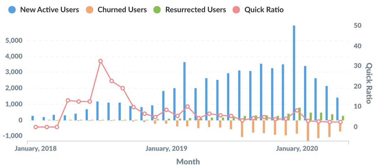
This chart illustrates several key aspects of your business in just one view. First, you can learn about the number of new users acquired over time and quickly note whether these numbers are increasing, decreasing, or if they are very volatile. Second, you can see how many users you are losing, and whether they come back afterwards (aka resurrected). Seeing how these three numbers comparel illustrates how leaky your bucket is.
Finally, combining active users with churned users, gives you a sense of your net growth using a quick ratio of: (New + Resurrected users) / Churned users. This easy ratio gives you an immediate gut check on the health of your business:
- If ratio is <1 = Active user base is shrinking so watch out, you have a negative net growth.
- If ratio >1 = Your user base is growing, so keep it up, you have a positive net growth.
While this ratio is a good quick indicator, it is not realistic to expect constant user growth. It is likely that you will face periods where acquisition will look good, for example, if you are investing in marketing strategies such as paid campaigns, or a referral program. However, your quick ratio can easily turn negative if your service demand is seasonal or if you scale back marketing efforts. The key here is to monitor closely and find ways to achieve sustainable growth in the long run.
2. Daily aggregates of total registrations and total users churned:
Plot the total number of registered users alongside total numbers of churned users to see the proportion of active users.
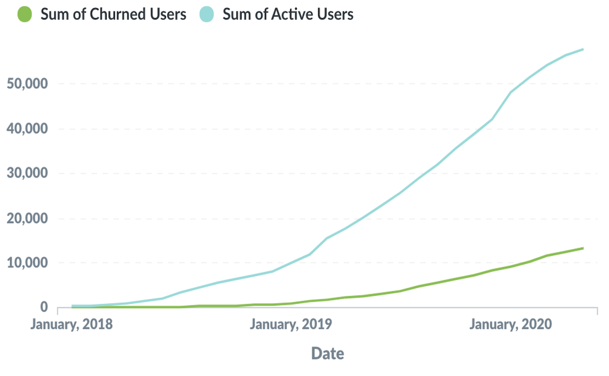
In contrast to the all-in-one chart above, aggregated metrics let you see when there has been an inflection point, and to see trends over time; whether user acquisition or churn has sped up, held constant, or slowed down.
Founders are all after hockey stick growth, and this is the chart in which to look for that sought-after shape. In the early days, you could look at this metric weekly or even daily, and as your product matures, a monthly glance might reveal more insights.
3.Total number of registrations:
Have an easy way to know how many users you have registered.
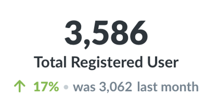
This number doesn’t really tell you much by way of insights, but leaders need to have near-constant access to the number of total users acquired to date for conversations with investors, stakeholders, and the press. This is an easy number that founders should always have on hand and be able to validate easily.
Bonus chart: If you can track acquisition by channel, you should include a chart that shows daily acquisition and churn by channel to understand which channels are serving your business best.
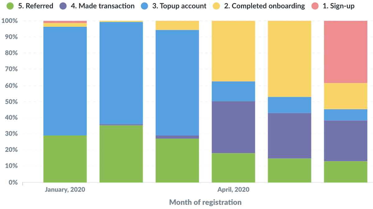
4. Activation funnel:
Plot the percentage of users that move through the funnel, from completing sign-up, to fully onboarding, to performing one transaction.
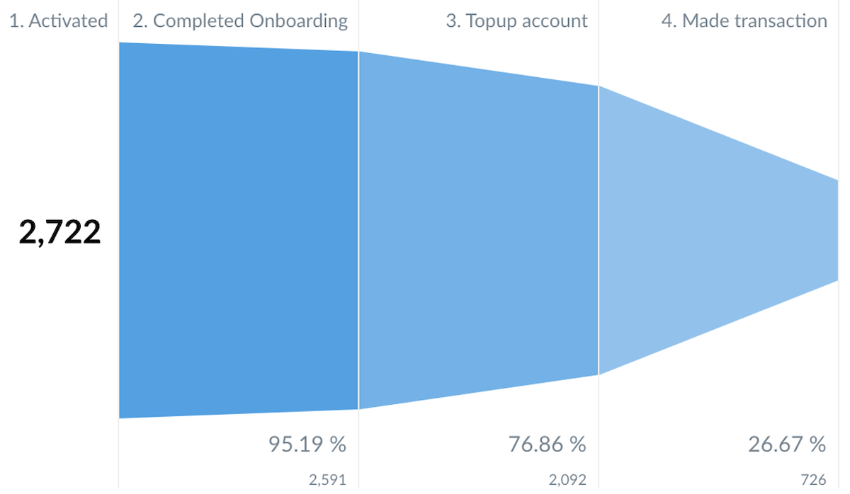
Users should move along clear onboarding journeys – albeit sometimes taking too long or needing a lot of support. There are multiple steps that an individual needs to take before graduating into an active user, and getting the funnel right is difficult. There are likely to be multiple friction points and bottlenecks along the way, and this chart will help you identify them, visualize where users are dropping off and make targeted changes. For example, this chart will allow you to realize sooner rather than later that only 20% of signed-up users perform the action (e.g., adding a baking account).
Remember that the funnel does narrow. You should expect a big drop between sign-up and the immediate next action. Don’t panic in that situation; instead experiment with onboarding changes and nudges, keeping careful track of how your funnel responds to changes in marketing, processes, and other features.
Bonus: As you improve your funnel mechanics, you can visualize this funnel by cohort to see how conversion rates are changing over time. Your objective should be that as you optimize conversion points with newer cohorts, your funnel gets wider.
3 charts on startup metrics for retention
5. Active vs Inactive Users:
Keep a real time track of the number and percentage of inactive users.
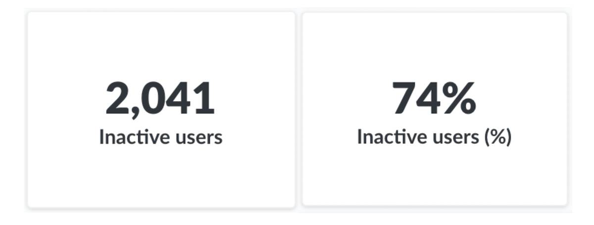
Sometimes, seeing a big number in your face is good enough to let you know that something is going wrong. For founders and product owners, it isn’t easy to digest and really internalize that acquired users have already gone away, and aren’t using your product anymore. It is hard to look at this number every day, but it is important that you do, so that you confront the hard truths about your business. Growth numbers can often mask a problem that this tracker will keep front-and-center so that you can focus on reaching your targets.
6. Survival curve:
Plot the % of users coming back to your product over time to show the proportion of users that your business retains over time.
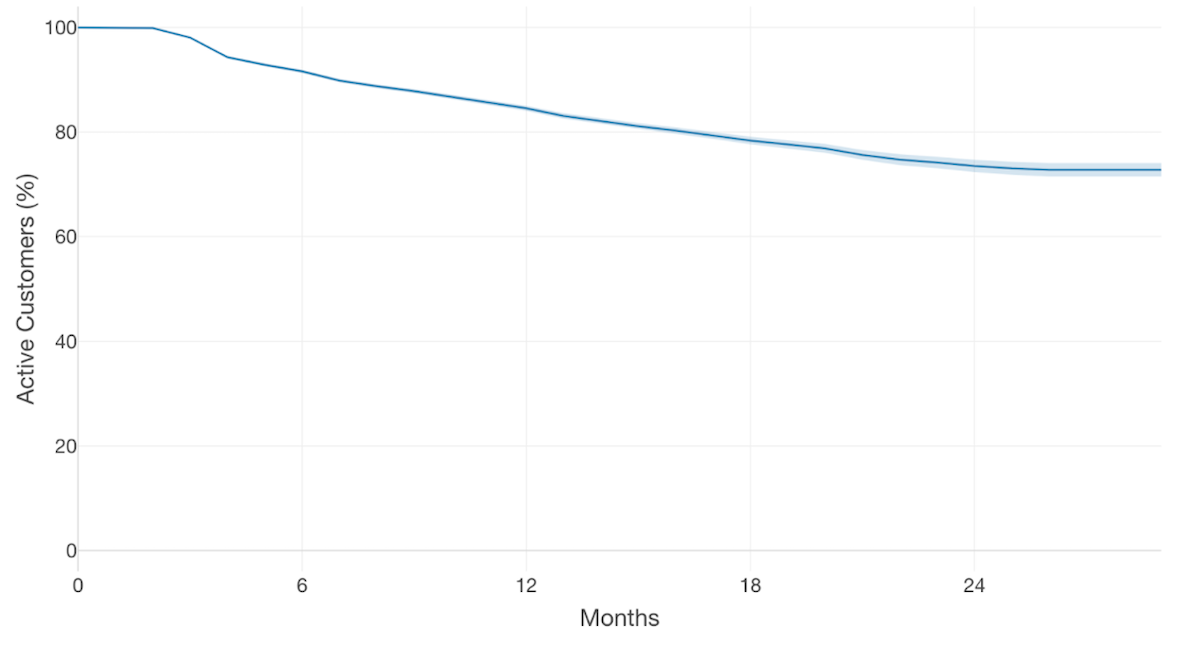
Measuring and improving user retention is critical to creating a sustainable business, and is often tougher to crack than acquisition. It tells you whether you have achieved product-market fit, so is a critical indicator for startups still in product development (Read how Sokowatch used this graph to refine their product).
The best way to understand retention is by measuring the percentage of users that come back and repurchase your product over time. While a downwards slope is normal, if your retention curve doesn’t flatten out at some point, it will become impossible to sustain true growth. If you are seeing a persistent downwards slope, consider investigating:
- How is retention trending between cohorts? Any notable successes/failures?
- How is retention faring among different segments? Why do some users churn and others don’t? Grao leveraged user research to investigate.
- How can you improve product features and usability? Growth hypotheses tracked with quantitative data can help resolve uncertainty about what is working and whaat’s not. Accion’s Product Testing Guide can help.
- What product and monitoring strategy do you need to improve your measures? BancoMare developed a data-informed strategy and agile methods to improve retention.
7. Triangle chart:
Chart retention by cohort over time to see how your retention numbers are faring with newer cohorts.
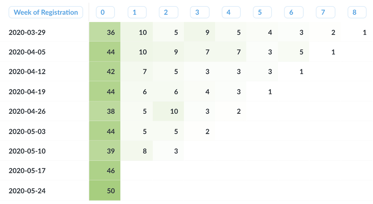
If you have noticed a retention problem and are working to resolve it, you would expect retention to improve over time, or at least not get worse. To easily visualize these improvements, treat each month’s activations as a cohort, and track the percentage of users in each group who come back and use the product over time.
Remember that startups are evolving and changing machines, so you can expect quite a bit of variation in these numbers. In just a couple of months or quarters, multiple aspects of the product, communication strategies, or processes could change. As such, do not over-invest in any change for good or bad in this retention chart, because it may just be noise. Instead, look for overall trends.
In all, getting your dashboard right will likely be a turning point for your business, your leadership, and even your bedtime routine, since you are likely to check these first thing in the morning and last thing before you go to sleep!